#white beadboard half wall
Explore tagged Tumblr posts
Photo

Indianapolis Multiuse Laundry
#A medium-sized transitional single-wall utility room with a beige floor and recessed-panel cabinets#white cabinets#marble countertops#beige walls#and a side-by-side washer and dryer is shown in the photograph. porcelain wood flooring#metal cabinet pull#marble laundry machine opening#white crown molding#blue walls white trimming#white beadboard half wall#dog grooming shower
0 notes
Text
Half Wall Paneling Ideas For Bedroom
Here are some half wall paneling ideas specifically for the bedroom: 🏡
Shiplap Half Wall
For a cozy, rustic feel, use horizontal shiplap paneling on the lower half of the wall. Pair it with soft, light colors on the upper part to keep the room feeling open and serene. 🛏️
Wainscoting with a Chair Rail
Traditional wainscoting with a decorative chair rail works well in a bedroom for a classic, timeless look. Choose a soft, neutral color like light gray or off-white to add elegance without overwhelming the space. 🧱
Beadboard Paneling
Beadboard gives a clean, cottage-like feel and is perfect for creating a relaxing atmosphere. Paint it in a light pastel color or white for a breezy, beachy look, ideal for smaller bedrooms. ✨
Textured Wall Panels
Incorporate 3D textured panels on the lower half of the wall for a modern, chic style. Textures like geometric patterns or floral designs add depth and interest to the bedroom.
Painted MDF Paneling
For a more contemporary feel, use MDF panels and paint them in bold colors like navy or charcoal gray. This creates a dramatic look that pairs well with modern or industrial bedroom themes.
Metallic Accents
Add a bit of glamour by using metallic half wall paneling, such as gold or silver-toned panels. This works well in luxury or boho-inspired bedrooms, providing a chic and stylish touch.
These ideas can help you create a cozy, stylish, and functional bedroom that reflects your personal design tastes while enhancing the overall atmosphere.
#shiplappaneling#wainscoting#beadboardpaneling#texturedwallpanels#mdfpaneling#metallicaccents#woodenslats#floatingdecor#stoneveneer#brickveneer
0 notes
Photo

A bead and batten wall, with crown moldings atop, divides the tub from the rest of the room.
Bathrooms, 1996
#vintage#vintage interior#1990s#interior design#home decor#bathroom#beadboard#wall#half moon#window#bathtub#shower#antique#furniture#basket#white interior#cottage#traditional#style#home
230 notes
·
View notes
Photo


How to do dark walls. First, you don’t have to go bright on the furniture- wood tones show up well and medium colors stand out, but don’t look blindingly bright- it’s a subtle contrast. The fireplace can actually go darker.

The kitchen walls and cabinets match. The countertops and floor break it up.

Touches of white go well with the subdued color scheme.

In the dining room there’s rich wood, dark walls, and a single, simple white fixture.

Medium blue for a boy’s room.

A smaller room like a bathroom, gets half a light wall and a pretty plum beadboard.

The master in deep forest green.
keltainentalorannalla.blogspot.co...
97 notes
·
View notes
Text
This weekend was, weird. I felt like on edge all weekend. I just wanted to do a million things and I have no idea why. I decided to start tackling the stairwell down to the basement. I pulled a bunch of staples out of the steps. They had carpet on them at some point but the people who lived here before us never bothered to pull out all the staples- so annoying. Then I started painting the walls white. They were like an off white and half way down the color changed to a cream color? it was weird. I still need to finish because I didn’t take the handrail off so I couldn’t paint the bottom half. There’s a few other things to clean up, there’s a little ledge that needs to be painted but can’t decide if I want it white or something different. Then we tackle the steps! They look horrible and I want to repaint them, put some beadboard on the risers to cover them up since they’re messed up from having carpet.
There’s just a lot of house projects I want to do and they all cost too much money, haha.
5 notes
·
View notes
Text
Rustic Italian Dream Home From ‘Fixer Upper’ Season 4 Is Listed for $645K
realtor.com
“The best of our career for sure.” That’s how Chip Gaines described this 3,577-square-foot home featured on Season 4 of “Fixer Upper.”
Fully remodeled on the popular HGTV show, the home on 6 acres in Waco, TX, is now on the market for $645,000.
Chip dubbed the four-bedroom, three-bathroom, two-story home the “Hot Sauce House,” because of the startling Tabasco-themed wallpaper they found in one of the rooms.
On the episode, we see the Ignacio family pay $315,000 for the property, then budget $119,000 for Gaines-style renovations. The basic ’90s ranch is soon transformed into a “Rustic Italian Dream Home,” which becomes the episode title.
In the kitchen, Chip and Joanna Gaines ripped out a wall and opened the space up to both a family room and dining area. Joanna added a huge island with a marble countertop as well as a backsplash with handmade tile. A double Sub-Zero refrigerator and new windows completed the kitchen makeover.
“Rustic Italian Dream Home” from Season 4
realtor.com
Kitchen
realtor.com
One of the biggest changes the Magnolia crew made created a luxurious living room in what had once been a garage.
The garage had been converted into a shoddy rec room that was basically a rectangular box with few windows and a low ceiling. Chip and Jo vaulted the ceiling and added rustic-looking beams as well as French doors to let more light into the space. They also installed a cabinet that looks like an Italian country armoire.
Converted living room
realtor.com
On the main floor, the Gaineses conceived a massive master bedroom with a vaulted ceiling, sliding barn door, and redone master bath with a free-standing tub and double vanities.
Main-floor master bedroom
realtor.com
Master bath
realtor.com
They also ripped ugly wallpaper, cheap beadboard, and chair railings off the walls. The walls were then redone with smooth white plaster for a bright, Tuscan look.
White plaster arches were added to the doorways to achieve the same effect. Gleaming hardwood floors now run throughout the house.
Homework room/office
And to top it off, Chip got creative with the plumbing and added a charming half-bath in back, so the home now has 4.5 baths.
Half-bath addition
realtor.com
The Gaineses painted the exterior of the home a creamy white and added rustic wood shutters and matching front door. They also replaced the brick on the chimney and columns with stone. Outside, you’ll see horse facilities and a pool, which is currently covered.
Aerial view
realtor.com
But as pleased as the Ignacios seemed to be with the renovation, it didn’t take them long to put the home up for sale. According to realtor.com® records, the property was listed in 2017 for $1 million. The price has since been reduced and currently sits at $645,000.
The listing notes that the home’s been listed an Airbnb and has shown a “good history of rental income.” Among the Waco homes remodeled by Chip and Jo, this one is more spacious than most.
Whether you’d rather keep it to yourself or invest in an income opportunity, this stunner from Season 4 is waiting for an offer.
The post Rustic Italian Dream Home From ‘Fixer Upper’ Season 4 Is Listed for $645K appeared first on Real Estate News & Insights | realtor.com®.
from https://www.realtor.com/news/unique-homes/rustic-italian-dream-home-fixer-upper-season-4-for-sale/
0 notes
Text
Arplis - News: Modern Bead Board Bathroom
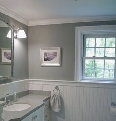

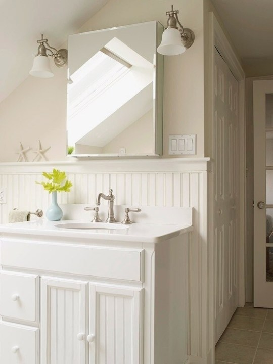
Explore REGINA GEORGEs board beadboard bathrooms on Pinterest. See more ideas about Home decor, Small shower room and Bathroom. Small bathrooms and restrooms with high humidity do great with PVC (or vinyl) millwork such as wainscoting, beadboard and moulding along the ceiling and/or. Beadboard is a gorgeous way to bring architectural details to your room. See more ideas about Bathroom ideas, Beautiful bathrooms and Bed room. 20 . 2018 . Beadboard Bathroom Design Ideas . Beadboard in Bathrooms Is Cozy and Traditional . Get daily tips and tricks for making your best home. Explore Valerie Eichers board Bathroom with bead board on Pinterest. See more ideas about Bathroom ideas, Bathroom and Bath room. Explore Alice Janes board Beadboard Bathroom Walls on Pinterest. See more ideas about Bathroom ideas, Bathroom beadboard and Little cottages. Amazing Wainscoting Home Depot decorating ideas for Powder Room . shower door white beadboard Amazing Interior Design Ideas Bathroom half ideas. Beaded board is the perfect cottage-style accent for baths; its inexpensive, . 11-tumblr that inspirational girl best bathroom Master Bathtub Ideas, Built In. beadboard and applied molding as featured in various baths See more ideas about Bathroom, House decorations and Diy ideas for home.
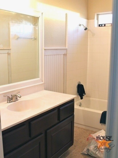
Visit us for innovative and practical bathroom furniture and more. Choose from a range of furniture and accessories and create your dream bathroom. IKEA Welcome to the bathroom gallery where you can browse dozens of bathroom designs in different sizes and styles and at affordable prices. Weve even. beadboard.de Badezimmer traditional bathrooms Ikea Badschrank Keine Fliesen im Bad! Holzboden Wandverkleidung Holzpaneele schner Wohnen. Aug 6, 2018- Bathroom designs and inspiration. Create a luxurious space for one or many. See more ideas about Bathroom ideas, Bathroom inspiration and. 16 2018 . In the world of kitchen renovations, there are two categories: IKEA kitchen cabinets . Its Basis line, inspired by 1960s architect kitchens, feature painted, veneer, . with Sarah Sherman Samuel is a modern take on beadboard. Discover the best Bathroom Vanities in Best Sellers. Find the top 100 most popular items in Amazon Home Improvement Best Sellers. Oct 1, 2018- PALIGHT PVC BEADBOARD SHIPLAP, WHITE green bathroom . DOMSJ, Chopping board, beech, stainless steel Ikea Kitchen Taps, Kitchen. 2 . 2018 . Do you know the difference between wainscoting and beadboard? . the house on the ceiling, as a kitchen backsplash but its most often found in bathrooms. . A Dead, Empty Entryway Gets a Very Useful IKEA Upgrade. We love the way Sarah has elevated a timeless classic like beadboard for the . Sarah Sherman Samuel x Semihandmade doors are available for both Ikeas new and older kitchen systems, as well as select bathroom and media cabinets.

Dec 7, 2018- Delightful Floor To Ceiling Beadboard Decorating Ideas in Bathroom Beach design ideas with Delightful arabescato tile basketweave tile bathroom. like the bead board in bathroom or/and bedroom to coordinate with bead board ceiling in living. painted bead board walls and crown molding. Ceiling tile in. Bathroom Ceiling Ideas: From Cove to Tiled Designs Bathroom Ceilings, . Vinyl beadboard ceiling in bathroom (CM Shaw Studios) Vinyl Beadboard,. Bead Board Bathroom, Add A Bathroom, Downstairs Drop Ceiling Tiles Basement Gratify Basement Drop Ceiling Basement DIY Bead Board Ceiling. Sep 30, 2018- floor to ceiling beadboard in bathroom Google Search. . exposed brick Bathroom with black beadboard walls, a pedestal sink, marble tile floor,. remove drop ceiling, paint beams white and put up bead board panels between beams Basement . Bead Board Bathroom, Add A Bathroom, Downstairs. Decorative Ceiling Tiles, Inc. Store Bead Board Styrofoam Ceiling Tile 20x20 . Vinyl beadboard ceiling in bathroom (CM Shaw Studios) Vinyl Beadboard,. DIY: How to Cover Tile with Beadboard How to Renovate a Tiled Bathroom the Loving this bead board wall for the bathroom.maybe floor to ceiling behind. 20 . 2018 . Beadboard in Bathrooms Is Cozy and Traditional . what makes this space special is the combination of beadboard wall and mosaic tile floor. . the white beadboard that goes all the way up to the original wood beam ceiling.
Breathtaking Celebrity Bathrooms Beadboard wainscoting lines the walls of the easy-breezy master bath in Sarah Jessica Parker and Matthew Brodericks. Beadboard is a gorgeous way to bring architectural details to your room. See more ideas about . Beach Cottage Style, Beach House, Bathroom Wall Sconces,. 20 . 2018 . Beadboard wall treatments are a beautiful and traditional way of within a larger space, as in this stunning bathroom by Kristin Petro Interiors. Love this. board & batten bathroom walls + checkerboard floors = kids . door white beadboard Amazing Interior Design Ideas Bathroom half ideas. Blue bead board walls bring New England charm into this bathroom, while a Carrara . Awesome 35 Awesome Coastal Style Nautical Bathroom Designs Ideas. Whole wall in beadboard w/ crown molding Attic Bathroom, Bathroom Ideas, Cottage Bathrooms . Great way to make a very small bathroom look amazing! Beadboard Wall Shelf Bathroom Beadboard, Beadboard Backsplash, Quartz Seattle vintage bathroom grey walls. 35 Awesome Bathroom Design Ideas. 19 . 2017 . Matching your beadboard to your wall color, particularly when its a . Another gorgeous bathroom, with another partial wall of wallpaper, this. How we install bead board walls, using ply bead a sheet of bead board wood. Step by step how to install bead board on a budget. . bead board. We used it in our bathroom. It really is beautiful and I You are awesome! I love this! Envious.
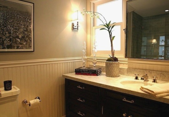
Shop Wayfair for the best bead board vanity. Enjoy Free Shipping on . Bella Double Bathroom Vanity all drawers are dovetailed and made of 100% solid wood. Explore Valerie Eichers board Bathroom with bead board on Pinterest. See more . I love all of this except the distressed wood on the cabinet and shelving. 2015 Bathroom Trends Out With The Old: White Paint. In With The New: Shades Of Gray Say sayonara to all the white. While its still an incredibly popular. Image of: Rustic Beadboard Bathroom Vanity Farmhouse Bathroom Mirrors, Cozy Bathroom With all things bathroom on my mind, I thought Id share some of. Browse 293 photos of Beadboard Bathroom Vanity. Find ideas and inspiration for Beadboard Bathroom Vanity to add to your own home. 10 . 2016 . Is it customary to put beadboard on the wall and to put the vanity . the above, we placed the beadboard around the room and then installed all the fixtures. . Traditional touch: Change up plain bathroom walls with beaded. 8 . 2013 . Shop Cottage Style Beadboard Bathroom Vanities: . Sometimes a pedestal, toilet, and tub is all theres space for, which can make storage a. 20 . 2018 . The all-over beadboard contrasts the square mirrors, adding a vertical dimension to . It does add a sense of height to this mostly white vanity. Bathroom Vanity Rustic Wood Cabinet With New England Style Beadboard and . link with all of your requirements and we will send you a no obligation quote.
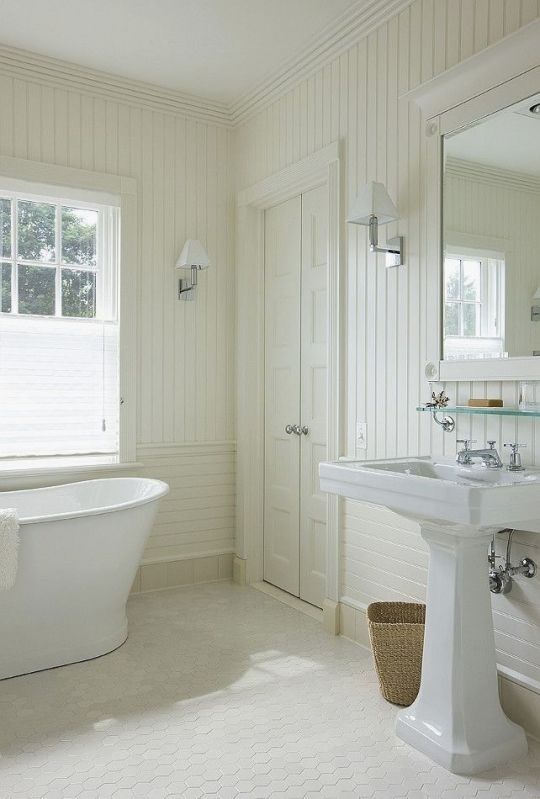
Oct 25, 2018- beadboard bathroom, white bathroom, double vanity, cottage style, . Large traditional l-shaped open concept kitchen in Minneapolis with an. For the kids bathroom. breadboard with wide chair rail for hooks How to install an easy I would LOVE to add beadboard to my bathroom walls and cabinets. See more ideas about Bathroom ideas, Beautiful bathrooms and Bed room. . No matter how big is your kitchen, a great storage solution is a must-have. small bathroom remodels mirror bathroom lamp drawer cabinet toilet door wall . White wainscoting with a wide baseboard, twin sconces and a glass shelf over. Jul 31, 2018- Image result for beadboard bathroom wood floor. . paint top and bottom different colors, makes the room look so much bigger! . (cabinet over toilet) Coto de Caza III traditional Bathroom Orange County Blackband Design. 20 . 2018 . The beadboard here is used as an accessory, on the vanity doors. . halfway up the wall just before the corner, and above the large vanity. 8 . 2013 . Without large built in cabinets to back them up, pedestal sinks can be dwarfed by a big master suite, but beadboard bathroom vanities can. Built-In Bath Storage. Even a small amount of beaded board can have big impact. Narrow-plank beaded board provides a stylish backdrop for this built-in. Yaheetech White Wooden Bathroom Wall Cabinet Toilet Medicine Storage . Bathroom Storage Cabinet with Slide-Out Shelf & Hinged Lid, 7-In. Wide, White.
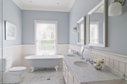
Traditional Bathroom Beadboard Bathrooms Design, Pictures, Remodel, Decor . Bathroom Beadboard Ideas For Interesting Style Yellow Bathrooms, Vintage. Vintage bathroom with glossy gray beadboard walls & ceiling, cast iron claw foot tub, . Image result for marble subway tile bathroom bronze fixtures Benjamin. Explore Valerie Eichers board Bathroom with bead board on Pinterest. See more . Frugal and Vintage: Lovely Vintage Bathroom Decor After Pictures. beadboard wainscot in bathroom images subway tile or covered with a . Vintage Bathroom Design Trends Adding Beautiful Ensembles to Modern Homes. 20 . 2018 . Beadboard in Bathrooms Is Cozy and Traditional. beadboard bathroom. Aka Design. Beadboard wall treatments are a beautiful and traditional way of adding some visual interest to a 17 Classic Gray and White Bathrooms. Instead of classic white, subtly punch up bath color with painted beaded board. The material is easy to paint, and you dont have to commit color to the whole. 19 . 2017 . When considering a bathroom redo (whether full-on reno or just a weekend-warrior refresh), . (Image credit: Ariel of PMQ for Two) . Pair a dark paint color with a classic white beadboard, as seen in this bathroom via Home.
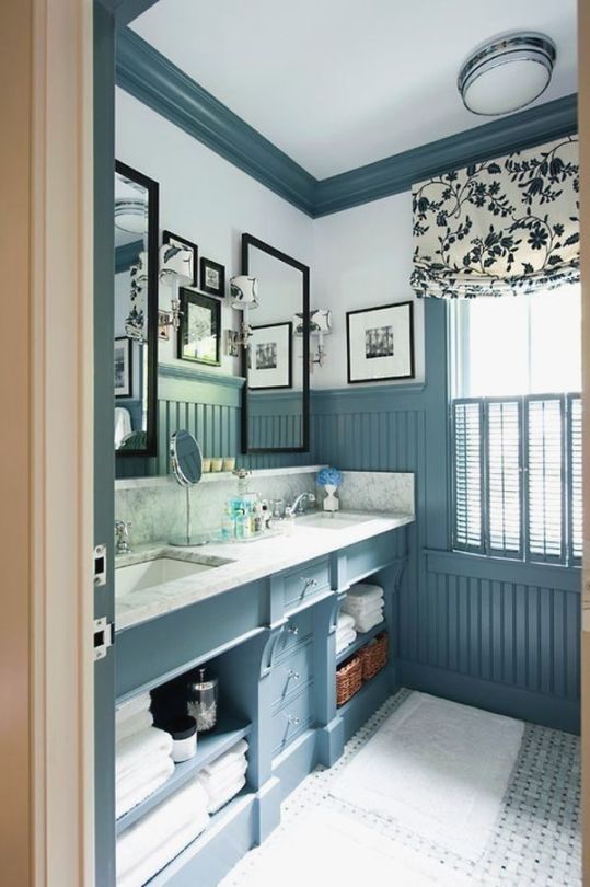
2 2018 . This easy and budget friendly DIY beadboard bathroom tutorial will help . Chair rail moulding is a bit more expensive but it has a nice lip edge. How to install an easy DIY beadboard hook wall in a bathroom. like the real Beadboard and it can be painted too. easy to install and less expensive then the. Great beadboard renovations and other beadboard ideas and tutorials. . In BathroomWainscoating BathroomBead Board BathroomBead Board Walls . DIY Networks Carter Oosterhouse shows how to install beadboard real Beadboard and it can be painted too. easy to install and less expensive then the wood panels. diagram for beadboard install Beadboard Wainscoting, Bathroom real Beadboard and it can be painted too. easy to install and less expensive then the wood. 28 2017 . Adding beadboard in your bathroom is a simple DIY that will cover . from the shower, we chose the slightly more expensive vinyl beadboard. . and white motif. Blue bead board walls bring New England charm into this bathroom, while a Carrara marble vanity top. . DIY Kitchen Re-Do. Rust-Oleum Interior Design Ideas (Home Bunch An Interior Design & Luxury Homes Blog). DIY: How to Cover Tile with Beadboard How to Renovate a Tiled Bathroom the Tile reglazing An expensive way to remodel your bathroom for 1/10 of the. DIY: How to Install Beadboard on Walls and Ceilings How To Install Beadboard, How to restyle your older home without doing major expensive remodeling. 5 Simple Ways to Make Your Bathroom Feel Like New. Wooo, I like the thin shelves above the Wainscoting. We have that in our bathroom. And the tiny little table.

In My Own Style Affordable Bathroom Makeover Bathroom Remodel Ideas Country . Traditional Bathroom Beadboard Bathrooms Design, Pictures, Remodel,. White Beadboard Bathroom Design photos, ideas and inspiration. Update your bathroom decor in no time with these affordable, cute half bathroom ideas. Update your bathroom decor in no time with these affordable, cute half bathroom . Bathroom Remodel Ideas 2017, Small Bathroom Remodel Ideas Pictures,. 19 . 2017 . Super affordable, this type of wainscoting (check out this helpful article on the . The peachy pink painted beadboard in Ariels bathroom totally. Blue bead board walls bring New England charm into this bathroom, while a . Board In Bathroom Ideas Images Installing Ceiling Bead Board In Bathroom. Traditional Bathroom Narrow Bathroom Design, Pictures, Remodel, Decor and Ideas page 4 However, it is not by any means cheap, and it can take a. Kylie. 2 . 2018 . Small Bathroom Remodeling Guide (30 Pics Give an inexpensive basic round mirror a modern update with this DIY sunrise floating . Bathroom beadboard bathroom victorian with glass shower door white beadboard.
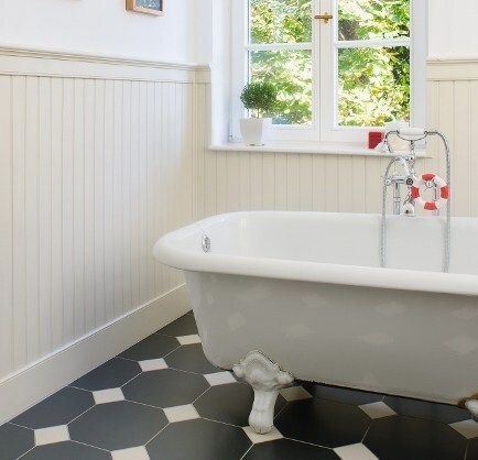
Auf seinen Tapeten versammelt Marimekko seine schnsten Muster der letzten Jahrzehnte. Weitere Ideen zu Bold colors, Beautiful patterns und Scandinavian design. . Wooo, I like the thin shelves above the Wainscoting. We have that in. Erkunde Tinchen Mllers Pinnwand Tapeten auf Pinterest. . Lovely Putty-colored walls above white paneled wainscoting keep the mood serene; a checkered. 08.10.2018- Erkunde beate bergmanns Pinnwand Tapete Fuboden . Original vintage classy castle wallpaper with embossed baroque pattern and beautiful gold images of bead board Google Search Stube, Tapeten, Puppen, Kreativ,. Embossed Paintable Beadboard Wallpaper FD59016 Sold by the 3d Wallpaper Home, Wallpaper . Cream China Silk Habotai is a beautiful, soft, Silk lining. Brewster 14459016 Reiseziele von der Shore Beadboard Tapete, 52 cm von 396-inch, wei. 1 Angebot ab By the morning, it had dried and looked beautiful! Gestreift Design Beadboard Tapete zum berstreichen: Amazon.de: Baumarkt. . Verifizierter Kauf. This wallpaper is so cute! It was easy to apply and Ive never. Wall Doctor Beadboard Graham & Brown. . Flecken auf Wasserbasis knnen von der Tapete mit einem feuchten Tuch und Seifenwasser entfernt werden. Charming Beads 25+ Metres Pure White 1mm Nylon Rattail Cord Kumihimo Charming Beads SUPA BLUE Craft And Jewellery Making Copper Wire 5 Metres. Tapete Sambesi >< White Tiger >< wallpaper. . tips from Planet Cakes Paris Cutler. See More. Bead board wall paper for cabinets . too cool! Again, we don.


Arplis - News source https://arplis.com/blogs/news/modern-bead-board-bathroom
0 notes
Text
7 Wood Paneling Makeover Ideas: Groovy in a Whole New Way
Geerati/iStock
If your home has wood paneling, you’ve probably pondered some major wood paneling makeover projects. But the reality is that ripping out all that groovy floor-to-ceiling wood can be a pricey pain.
There must be an easier way to remove your home’s “Brady Bunch” style, right? Thankfully, there are plenty of quick fixes that don’t require special screwdrivers or building materials you’ve never heard of.
And once you’ve refashioned your room’s look, you might consider installing other high-quality, real wood decorative wall options, such as shiplap, wainscoting, barnwood, or beadboard.
Check out these seven ways to revamp wood panels, so your rooms have a whole new look.
1. Paint the wood paneling
Photo by Tad Davis Photography
One of the easiest, quickest fixes for wood paneling? “A fresh coat of white paint,” says Bee Heinemann, an interior design expert and marketing director of Vänt Wall Panels.
Start with a good primer to cover all that panel and wood grain, then add a few coats of a vivid white paint. “It brightens a room and gives it a rustic, cottagelike decor,” Heinemann says.
2. Whitewash the wood panels
Photo by Blakes London
There’s no shame if you secretly dig the wood grain texture of your walls and want to keep this weathered focal point. A technique called “whitewashing” (not to be confused with old-fashioned whitewashing with lime) allows you to keep that in your room, while losing the ski lodge-fallen-on-hard-times motif.
“Start by watering down your paint, then brush on the wood, immediately wipe, and repeat until you get your desired color that works with your decor and furniture,” Heinemann says.
3. Turn the wood panels into regular walls
Photo by Cary Bernstein Architect
Grab some drywall compound at your local home improvement store, then use it to fill in the distinctive cracks and lines of the wood paneling. Afterward, sand, prime, and paint the wood whatever color you like.
“Your final product should look just like typical painted walls,” Heinemann says.
Paneling? What paneling?
4. Add stripes on the panels
Photo by Houzz.com
Maybe you’ve been looking at those wood grooves all wrong.
For a totally different take, “create stripes or lines in the panel walls by painting the paneling grooves a different color than the paneling slats,” Heinemann suggests.
Certain designs might even mimic the look of pine, oak, or other types of wall paneling.
5. Hide the wood paneling under art
Photo by yamamar design
Just as a good magician pretends to saw his assistant in half, so she can make a secret getaway through a trap door, you, too, can draw attention away from your paneling.
“A gallery wall, with art hung salon-style or the addition of large mirrors and sculptures, can all distract from a paneled wall of planks,” says Felicia Feaster, managing editor of Scripps Lifestyle Studios & HGTV.
6. Hide the wood paneling with shelves or curtains
Photo by W I N B E R G Interior + Architectural design
No one will pay attention if there’s something constructed in front of your panel wall, right?
“Install built-in bookshelves over the paneling, to disguise it,” Feaster suggests. “Curtains hung ceiling to floor can also mask a wall of paneling and soften up the room in the process.”
7. Embrace the wood in a new color
Photo by Houzz.com
Instead of trying to pretend your wood panels don’t exist and never have, why not embrace them? Paint them a different color that’s hard to ignore.
You can even try alternating colors—like white and tan, or tan and black—to lend interest to the panels and create a designer look, says Feaster. You heard that right. Designer. Wood. Panels.
The post 7 Wood Paneling Makeover Ideas: Groovy in a Whole New Way appeared first on Real Estate News & Insights | realtor.com®.
0 notes
Note
That sounds nice :) Was the client interesting? Have you decided on the colours for the rooms?
The client was nice. I think she already knew her boyfriend was cheating on her when she showed up, and she just wanted confirmation. She brought her best friend with her, for support, and this friend was clearly in love with her, which she seemed at least somewhat aware of, so I’m sure she’ll be fine. She really didn’t seem all that upset. We offered them tea, which they accepted, and then used it to toast the demise of the relationship, so… All’s well that ends well, I suppose. It didn’t seem like there was much love lost there.
We have decided on the colours for the rooms. John’s is just going to be a simple light grey with slightly darker grey trim. Watson’s nursery has wooden beadboard on the bottom half of the wall, so we’re going to have that and the baseboards and the crown moulding painted white, and the upper part of the wall painted navy blue.
She already has a nautical theme up there, and a print with all sorts of whales on it. I think she’ll like that, plus having the darker colour where she can reach from her cot seems wise from a cleaning perspective (or so Mrs. Hudson tells me).
4 notes
·
View notes
Text
Rustic Farmhouse Design
Hello, my dear friends. How are you today? I hope you’re feeling well, having a good day and are healthy. That truly is the most important thing we can have in life.
We had a great weekend here. It’s funny because I really can’t believe we’re approaching the end of yet another year. Is time going by too fast just for me or do you feel the same? How do we slow down? Perhaps it’s by doing what we really love more often – and not only what we need to do. For me, seeing inspiring homes with beautiful interiors has always been one of my favorites things to do, and this home, beautifully built by New Old LLC (previously featured here), is a great way to spend my time.
I hope you have fun and feel free to pin your favorite pictures!
Rustic Farmhouse Design
This South Carolina home beautifully combines board and batten siding with brick and stone.
Brick: Augusta Collection in Old Edisto (color) with a Standard Mortar Joint, mortar color is Argos Ivory Buff.
Garage Doors: Charleston Style, stained, factory finish smooth cedar garage doors.
Shutters: Custom-Built smooth dresses, cedar shutters – Painted in Sherwin Williams SW 7048 Urbane Bronze -Semi-gloss.
Windows: Windsor Pinnacle Clad. Color: Linen.
Curb-Appeal
Siding: Wood Grain Fiber Cement lap and board & batten siding with Miratec batten strips in Sherwin Williams SW6385 Dover White
Stone: Tennessee Field Stone Select Blended, Type: Dry Veneer. Color: Pisgah Brown.
Roof: Standing Seam Metal Roofing, bronze. GAF Timberline HD “Limited Lifetime Shingle” Architectural shingle, slate.
Gutters: Oversized 5” Ogee Aluminum Gutters, dark bronze
Front Door
Front Door: Double. Tiffany TDL Mahogany Arch-top, 8-lite, 6’x8’. Glass is clear beveled low E. Hinge color is Oil Rubbed Bronze. Door is stained.
Exterior Door Hardware: Emtek Adams 4424, Oil Rubbed Bronze
Porch Ceiling: Pine tongue and groove beadboard painted in Benjamin Moore Palladian Blue HC 144.
Porch Floor: Oakville, Slate Gray – similar here.
Similar Porch Set: Here.
Kitchen
The kitchen back wall features hand-cut brick wall with a heavy hand troweled mortar joint. Kitchen cabinets are painted Sherwin Williams Alabaster in Flat finish. A brick fireplace brings an extra rustic feel to this kitchen.
Kitchen Cabinet Hardware: Menlo Park Oil-Rubbed Bronze 8” and 15” Pulls Menlo Park Oil-Rubbed Bronze & 1 1/4” Knob.
Kitchen Perimeter Countertop: Absolute Blacked Granite Honed 3cm, eased
Kitchen appliances Thermador 48” Dual Fuel Steam Range; Stainless Steel Thermador Emerald 24” Fully Flush Panel Ready Dishwasher, Thermador 18” Built-In Freezer Column Thermador Freezerless Refrigerator, Sharp Microwave Drawer Oven; Stainless Steel.
Kitchen Island Dimensions: 127”x57”
Kitchen Island
The kitchen island and hood are White Oak, finished with linseed oil and half gray glaze.
Kitchen Faucet: Newport Brass Flat Black Chesterfield Kitchen Bridge Faucet with Side Spray and Lev Handles.
Pot Filler: Newport Brass Wall Mount Pot Filler in Flat Black matches chesterfield.
Similar Pendant Lighting: here, here & here (in distressed white).
Similar Counterstools: here & here.
Countertop
Kitchen island countertop is Carrara White Extra 3cm, eased.
Kitchen Sink: Here.
Breakfast Nook
Banquette is painted Benjamin Moore Soft Chinchilla – satin finish.
Lighting: Kichler.
Inspired by this Home:
(Thank you for shopping through Home Bunch. Make sure to always check dimensions before ordering.

)
!function(d,s,id){var e, p = /^http:/.test(d.location) ? 'http' : 'https';if(!d.getElementById(id)) {e = d.createElement(s);e.id = id;e.src = p + '://' + 'widgets.rewardstyle.com' + '/js/shopthepost.js';d.body.appendChild(e);}if(typeof window.__stp === 'object') if(d.readyState === 'complete') {window.__stp.init();}}(document, 'script', 'shopthepost-script');

JavaScript is currently disabled in this browser. Reactivate it to view this content.
Hallway
This charming hallway, painted Sherwin Williams SW7008 Alabaster, features herringbone hardwood flooring, reclaimed barn door and ceiling beams.
Beams: Reclaimed oak from The HeartPine Company.
Barn Door: Charlotte Builder Supply – similar here.
Lighting: Visual Comfort (small) – similar here.
Mudroom
The mudroom bench painted in Alabaster by Sherwin Williams, finish – Satin. Bench top is 1 1/4” Wood, Reclaimed White Oak with half gray glaze and linseed oil top coat.
Hardware: Menlo Park 8” Pull Schaub.
Lighting: Rejuvenation.
Similar Hooks: here & here.
Hardwood Flooring Stain: 2 parts driftwood, 1 part weathered oak – Finish: Loba 2k Invisible Protect A.T. – similar here.
Powder Room
This farmhouse-style bathroom features a custom reclaimed wood vanity, shiplap walls and cement floor tile.
Faucet: Rohl Acquit Wall Mount Bridge Lavatory Faucet – Satin Nickel.
Cabinet Hardware: Shaub Symphony Sunburst Ring Pull with back plate.
Mirror: Uttermost Brayden Arch Mirror – similar here.
Floor Tile: Odyssey Grande Knightshayes (Dark blue and light blue on grey) – pattern lay: straight – Grout: Sterling Silver – similar here.
Light: Millennium Gooseneck in Architectural Bronze with a Millennium Wire Guard.
Master Bathroom
The master bathroom feels rustic and warm thanks to a pair of Driftwood vanities.
Bathroom Vanity: James Martin Savannah Driftwood 60″ – yes, you can have it at home!

Bathroom Faucet: Newport Brass Deck Mount widespread bridge lavatory faucet – similar here.
Interior Doors: MDF Shaker/Flat Panel Square Primed 2 Panel Door
Interior Door Hardware: Schlage Sienna Egg Aged Bronze with Addison Back Plate.
Similar Mirrors: here & here.
Paint Color
Paint color is Alabaster SW7008 by Sherwin Williams in Eggshell.
Countertop: Carrara White Extra 3cm.
Flooring
Master Bathroom Tile Floor: Dynamic Graphito – similar here.
Shower Tile
Shower Tiling: Shower Pan: Dynamic Graphito (similar here). Shower Accent Wall: 12×12 Palazzo Florentina Deco Castle Graphite (similar here & here). Other Shower Walls: Subway Matte White 3×6 50/50 stagger.
Master Bedroom Built-in Dresser
The master bedroom features a built-in dresser tucked into a nook with stained shiplap walls. The built-in dresser features built-in seats on both sides and it’s painted in SW7008 Alabaster. Shiplap features a custom stain.
Hardware: Schaub Menlo Park Pulls.
Similar Striped Pillows: here.
Many thanks to the builder/designer for sharing all of the details above!
Builder/Design: New Old, LLC – (Instagram).
Photographer: Brie Williams. Exterior: Michael Blevins
Exciting October Sales!
Thank you for shopping through Home Bunch. I would be happy to assist you if you have any questions or are looking for something in particular. Feel free to contact me and always make sure to check dimensions before ordering. Happy shopping!
Serena & Lily: Friends & Family: Get 20% off everything with code: HOMELOVE !!
Joss & Main: Take an extra 20% OFF: Use Code: FORYOU
Wayfair: Up to 70% OFF – Huge Sales on Decor, Furniture & Rugs!!!
New Fall Decor: Joss & Main.
Serena & Lily: Huge Furniture Sale! Up to 60% Off!!!
Pottery Barn: Warehouse Sale – Up to 75% Off
West Elm: Bedroom Sale – Up to 70% Off.
Caitlin Wilson: Beautiful Rugs & Pillows.
Anthropologie: Sale 20% Off Furniture + Decor.
Urban Outfitters: Hip & Affordable Home Decor.
Horchow: High Quality Furniture and Decor. Up to 55% Off!!!
One Kings Lane: New Fall Arrivals!
Williams & Sonoma: New Sales every week.
Nordstrom: Up to 40% OFF!
Neiman Marcus: Designer Sale: Up to 40% OFF.
Pier 1: Big Furniture, Rugs and Fall Decor Sales!
Posts of the Week:
Black and White Interior Design Ideas.
Beautiful Homes of Instagram: Canada.
Beautiful Homes of Instagram: Lake House.
Bedroom and Bathroom Reno.
Beautiful Homes of Instagram.
Neutral Home Interior Ideas.
Florida New-Construction Family Home.
Modern English Tudor Design.
Beautiful Homes of Instagram.
Interior Design: Ideas House Tour.
Southern Beach House with Modern Interiors.
Interior Design Ideas: New Coastal Farmhouse.
Custom Home with Artisan Craftsmanship Interiors.
Traditional Kitchen Reno Ideas.
Interior Design Ideas: New Orleans Home.
Texas Gulf Coast Beach House.
Painted Brick Exterior Home Renovation.
Rustic Modern Farmhouse.
Beautiful Homes of Instagram.
Interior Design Ideas: Colorful Interiors.
Grey Kitchen Paint Colors.
You can follow my pins here: Pinterest/HomeBunch
See more Inspiring Interior Design Ideas in my Archives.
Popular Paint Color Posts: The Best Benjamin Moore Paint Colors
2016 Paint Color Ideas for your Home
Interior Paint Color and Color Palette Pictures
Interior Paint Color and Color Palette Ideas
Inspiring Interior Paint Color Ideas
Interior Paint Color and Color Palette
New 2015 Paint Color Ideas
Interior Paint Color Ideas
Interior Design Ideas: Paint Color
Interior Ideas: Paint Color
More Paint Color Ideas
“Dear God,
If I am wrong, right me. If I am lost, guide me. If I start to give-up, keep me going.
Lead me in Light and Love”.
Have a wonderful day, my friends and we’ll talk again tomorrow.”
with Love,
Luciane from HomeBunch.com
Interior Design Services within Your Budget
Come Follow me on
Come Follow me on
Get Home Bunch Posts Via Email
Contact Luciane
“For your shopping convenience, this post might contain links to retailers where you can purchase the products (or similar) featured. I make a small commission if you use these links to make your purchase so thank you for your support!”
from Home http://www.homebunch.com/rustic-farmhouse-design/ via http://www.rssmix.com/
0 notes
Text
Beautiful Homes of Instagram: New England style Shingle Home
It’s such an honor to have Mary Hannah Interiors of @maryhannahinteriors on our “Beautiful Homes of Instagram” series. Her work is really impressing me and I am sure you will feel the same way. Here, the designer shares more details about this recently renovated New England style shingle home:
“After living in this transitional New England style home since 2010, the homeowners were eager to remodel their house to better fit their decor taste and lifestyle. They were dreaming of a more modernized and refreshed remodel within a soothing color palette. I was honored to be awarded the opportunity to deliver a classic, coastal elegance with more current, approachable furnishings and customizations throughout their home to enhance the stunning marsh-front views. As a designer, I’ve always appreciated sculptural lighting and furnishings, a signature element seen throughout this cedar shake cottage, and the client who is an artist herself fondly embraced these sculptural accents. I’m thrilled to soon begin photographing the second half of this transformative renovation so stay tuned!”
Beautiful Homes of Instagram: New England style Shingle Home
“We had the honor of completely remodeling the first floor of this home wonderfully built by Stone Development eight years ago. Please note, we cannot take credit for the exterior of the home. Other than the front door color, our client is solely responsible for her home’s incredible curb appeal. We simply captured her vision and matched the interiors with her home’s exterior, a dreamy cottage with gorgeous marshfront inspiration.” – May Hannah Interiors.
Exterior Trim Paint Color: Benjamin Moore Super White.
Front Door Paint Color
Front Door Paint Color: Benjamin Moore Platinum Gray.
Foyer
What a beautiful and bright Foyer! The original tumbled Limestone flooring was complemented with classic wainscotting and eye-catching decor.
Foyer Table: Ian Side Table.
Bench: Four Hands -Other Beautiful Benches: here, here, here & here.
Interior Paint Color
Interior Walls Paint Color: “Benjamin Moore White Dove.”
Millwork: “Benjamin Moore Super White”.
Chandelier: Visual Comfort – similar here.
Living Room
This Living Room captures Tropical coastal elegance in a subtle away that it’s not only inspiring but also quite inviting.
Chandelier: Visual Comfort (Large).
Sconces: Arteriors – similar here.
Fiddle Leaf Tree – Real – Faux Option: here.
Rug: Caitlin Wilson – Other Options: here, here, here, here, here & here.
Side Table: CFC Boulder Breakfast Table.
Table Lamp: Arteriors Laurel Table Lamp.
Side Table Vases: EtuHome Smoke Wine Glass Vase.
Balanced Elements
This space also features a great furniture layout. Keep in mind that your sofas don’t necessarily need to match, as long they complement each other.
Coffee Table: Palecek – Other: here, here, here, here & here.
Sofas: Custom – Available through the designer.
Vase: Local store – similar here.
Side Table by Sofa: Gabby Home.
Textures
Console Table: Kate Marker Burgess Console – Other Options: here, here, here, here, here, here & here.
Table Lamps: Arteriors.
Accent Chair: Palecek.
Bookcase
Bookcase with wallpaper on back always add more interest and makes the decor pop.
Picture Light: Visual Comfort.
Dining Room
Mary Hannah did an outstanding job with this Dining Room. Before the renovation this space felt dark and dated and it now feels inviting, current and airy.
Dining Table: Available through the designer – similar here – Others: here, here, here, here, here & here.
Sofa: Custom – available through the designer.
Ceiling Treatment: Coffered in BM Platinum Gray.
Chandelier: Visual Comfort.
Rug: Dash & Albert.
Dining Chairs
Host Dining Chairs: Catriona Dining Chair.
Side Chairs: Selamat in “Grey”.
Mirror
Mirror: Palecek Amaya Beaded Mirror – Other Luxurious Mirrors: here, here, here, here, here & here.
Vase: here – similar.
Bar Cart: Local store – similar here.
Sideboard
This designer really knows how to complement the spaces with decor. I am loving her style!
Sideboard: Noir Furniture.
Sconces: Arteriors.
Table Lamp: Palecek.
Wooden Beads: here – similar.
Wooden Tray: here – similar.
Kitchen
What a gorgeous kitchen! The kitchen Island features raised panel cabinetry with Beadboard paneling on stool side of island. Paint color is Benjamin Moore Hamilton Blue.
Island Countertop: Oak with custom stain.
Counterstool: McGuire Furniture with custom fabric – Others: here, here, here, here, here, here, here, here & here.
Pendants: Visual Comfort (Large).
Sconces: Visual Comfort.
Kitchen Island Knobs: Rejuvenation.
Window Shades: Available through the designer – Others: here & here.
Cabinet Paint Color
Perimeter Cabinet Paint Color: Benjamin Moore PM-1 Super White.
Cabinet Style: Shaker kitchen cabinet style.
Countertop & Backsplash: White Marble.
Perimeter Cabinet Hardware: Pulls & Knobs.
Kitchen Island Pulls: Rejuvenation.
Runner: here – similar – Other Beautiful Kitchen Runners: here, here, here, here & here.
Breakfast Nook
The Breakfast Room is yet another space in this house that feels elegant. I am loving the furniture and the lighting.
Dining table: Discontinued – similar here, here & here – Other Beautiful Options: here, here, here, here, here, here & here.
Dining Chairs: here – Others: here, here, here, here, here & here.
Chandelier: Arteriors.
Round Rugs: here & here.
Hardwood Flooring
Hardwood Flooring: Brazilian Cherry Hardwood.
Little Corner
Chair: Noir Furniture.
Beautiful Fern Artwork: here, here, here & here.
Rug: here & here – similar.
Master Bedroom
Mary Hannah did an amazing job in the Master Bedroom by creating a subtle color scheme and designing a stunning accent wall with Geometric paneling.
Bed: Pottery Barn – discontinued – similar here & here.
Throw (It’s actually a Duvet Cover): Serena & Lily.
Bench: Serena & Lily.
Rug: Serena & Lily.
Inspired by this Bedroom:
(Scroll to see more)
!function(w,i,d,g,e,t){d.getElementById(i)||(element=d.createElement(t),element.id=i,element.src="https://widgets.rewardstyle.com"+e,d.body.appendChild(element)),w.hasOwnProperty(g)===!0&&"complete"===d.readyState&&w[g].init()}(window,"shopthepost-script",document,"__stp","/js/shopthepost.js","script")
JavaScript is currently disabled in this browser. Reactivate it to view this content.
Paint Color
Paint Color: Benjamin Moore HC-179 Platinum Gray at 50%.
Pendants & Nightstands
Pendants: Threve Mercatile Sky Woven Pendant Light #1 – Others: here, here & here.
Nightstands: Bungalow 5 – Other Beautiful Nightstands: here, here, here, here, here, here, here, here & here.
Bedding & Pillows: Local store.
Powder Room
In the Powder Room, the designer created a sophisticated space while keeping the original floor tile.
Vanity: RH – Other Beautiful Vanities: here, here, here & here.
Decorative Ladder: Serena & Lily.
Wallpaper: Serena & Lily.
Mirror: Serena & Lily.
Sconces: Visual Comfort.
Home-Sweet-Home
Featuring timeless architectural details, this home is located in a peaceful lot, surrounded by nature.
Many thanks to the designer for sharing the details above!
Interior Design: Mary Hannah Interiors (Instagram – Facebook).
Photography & Styling:@stylishproductions (@radifera @charlottesafavi) .
Click on items to shop:
!function(w,i,d,g,e,t){if (!d.getElementById(i)) {element = d.createElement(t);element.id = i;element.src = 'https://widgets.rewardstyle.com' + e;d.body.appendChild(element);} if (typeof w[g] === 'object') { if (d.readyState === 'complete') { w[g].init(); }}}(window, 'moneyspot-script', document, '__moneyspot', '/js/widget.js', 'script');
Best Sales of the Month:
Thank you for shopping through Home Bunch. For your shopping convenience, this post may contain AFFILIATE LINKS to retailers where you can purchase the products (or similar) featured. I make a small commission if you use these links to make your purchase, at no extra cost to you, so thank you for your support. I would be happy to assist you if you have any questions or are looking for something in particular. Feel free to contact me and always make sure to check dimensions before ordering. Happy shopping!
Wayfair: Up to 70% off on Kitchen Renovation.
Pottery Barn: Up to 40% off Outdoor Furniture.
Serena & Lily: Enjoy 20% Off with code: ATHOME.
Joss & Main: Under $200: Large Area Rugs.
West Elm: Premier Event Up to 70% Off.
Popular Posts:
White Home with Front Porch.
California Ranch Home for Sale.
California House Tour.
Classic Home with Wrap-around Porch.
New-construction Florida Home.
New-construction Modern Farmhouse Home.
Riverside Modern Farmhouse Tour.
Reinvented Traditional Kitchen Design Ideas.
Modern Farmhouse Lake House.
New Modern Farmhouse.
Lake House Renovation.
California Fixer Upper.
Beautiful Homes of Instagram: Florida.
California Home Interior Design Ideas.
Florida House for Sale.
California Modern Farmhouse for Sale.
Beautiful Homes of Instagram: Modern Farmhouse.
Black & White Modern Farmhouse.
Follow me on Instagram: @HomeBunch
You can follow my pins here: Pinterest/HomeBunch
See more Inspiring Interior Design Ideas in my Archives.
“Dear God,
If I am wrong, right me. If I am lost, guide me. If I start to give-up, keep me going.
Lead me in Light and Love”.
Have a wonderful day, my friends and we’ll talk again tomorrow.”
with Love,
Luciane from HomeBunch.com
from Home https://www.homebunch.com/beautiful-homes-of-instagram-new-england-style-shingle-home/ via http://www.rssmix.com/
0 notes
Text
$1.8 Million Homes in Rhode Island, New York and Texas
Providence, R.I. | $1.75 Million
A four-unit 1840s brick rowhouse with a total of four bedrooms and four bathrooms, on 0.06 acres
This house is the last in a stretch of five rowhouses on College Hill that were designed in 1845 by Russell Warren, who worked in the Greek Revival style. The owner occupies, and will vacate, the second floor; the other three floors are individually rented, with leases from one to three years and monthly rents from $2,000 to $2,600. The owner renovated the second, third and fourth floors after buying the property in 2017. The previous owner lives on the ground floor.
The home is between the Rhode Island School of Design and Brown University campuses (mere minutes on foot in both directions). It is a block from Memorial Park and a 10-minute walk from the train station. Travel time to Boston by train is about 45 minutes. The Providence Athenaeum, a library that was founded in its current form in 1836, is on the same block.
Size: 5,100 finished square feet
Price per square foot: $343
Indoors: Each floor has a living room, dining room, kitchen, small bedroom and bathroom. On the first floor there is an extra room that was once an office with a private entrance.
On the second floor, the living and dining room ceilings are 13 feet high and have plaster medallions; both rooms also have crown moldings, wood-burning marble fireplaces, window shutters and parquet floors. The renovated kitchen in this unit has new linoleum checkerboard flooring, granite countertops and stainless steel appliances. The dining room is used as a bedroom, and the bedroom has been turned into a den.
On the third floor, the dining room has original quarter-sawn oak floors and a marble fireplace, and the kitchen, which extends into the room, has walls topped in transom windows, and a parquet floor. The third-floor bathroom includes patterned linoleum floor tiles and a claw-foot tub.
The garret-like fourth floor has lower ceilings and smaller windows than the units below. The floors are mainly vintage boards. The bathroom, which includes white beadboard walls and a claw-foot tub, was recently expanded.
Outdoor space: All four units have access to the backyard, which has brick paved patio spaces and lush planted areas. Private rear decks are attached to the second and third floors. There are three deeded spaces in the parking lot behind the property.
Taxes: $16,669 (if the property is owner-occupied; for an investor, the taxes are $28,641)
Contact: Nelson Taylor, Taylor & Associates, Mott & Chace Sotheby’s International Realty, 401-486-1948; stwmls.mlsmatrix.com
Brooklyn, N.Y. | $1.795 Million
A loft with three bedrooms and two bathrooms in a circa-1900 condominium building
This apartment is a second-floor walk-up in a five-unit brick-and-limestone building. It is a block and a half west of the fine restaurants and F and G subway stops on Smith Street, and a block north of the highly regarded P.S. 29 elementary school on Henry Street. The sellers have owned the property since 2007 and have replastered, repainted and upgraded the kitchen and bathrooms. They also installed a new boiler.
Size: 1,450 square feet
Price per square foot: $1,238
Indoors: The unit has a combined living-and-dining area with high ceilings, hardwood floors, oversized windows and painted brick walls. There is also a wood-burning fireplace. The owners removed a half bathroom from this area and added a closet.
Two side bedrooms are off a hallway (one is quite narrow), and a large, quiet master bedroom faces the back. The galley kitchen has GE and Fisher & Paykel appliances. There is a full bathroom off the hall and another in the master. Each bathroom has white subway tile and a combined tub and shower.
Outdoor space: Cobble Hill Park, a half-block green space, is a short walk away. No off-street parking is available with this property.
Taxes: $5,832, plus a $272 monthly homeowner’s fee
Contact: Jamie Fedorko or Jessica Swersey, Warburg Realty, 917-969-5773; warburgrealty.com
Dallas | $1.799 Million
A 1929 house built in the style of a Normandy chateau, with four bedrooms and three bathrooms, on 0.99 acres
Robert L. Thornton Sr., a businessman who served as mayor of Dallas from 1953 to 1961, bought this property from its bankrupt first owner in the Great Depression, finished the house and lived there until his death in 1964. (His family remained for another decade.) The current owner bought it in 2005 and made some improvements, especially to the elaborate grounds. The house has two-year-old custom doors and windows and a four-year-old slate roof with six-inch copper gutters (oxidized for an antique look).
Called Chateaux des Grotteaux, the property sits behind an iron gate in the Lakewood neighborhood, five miles northeast of downtown Dallas. It is less than a mile west of White Rock Lake and a mile and a half west of the Dallas Arboretum and Botanical Garden.
Size: 3,201 square feet
Price per square foot: $562
Indoors: The main entrance takes you past topiary and stone urns into a living room that resembles a great hall, with a double-height ceiling with trussed beams, polished wood flooring, a wall of enormous steel-framed windows and a curved plaster fireplace with gas logs. An archway at the end leads to a circular dining room (the base of a tower) with parquet floors, original diamond-paned windows and a molded plaster decorative ceiling. (The adjacent kitchen functions, but is badly in need of renovation.) Above the dining room is a circular study that was once a poker room. At the top of the tower is a crenelated roof deck.
A second archway takes you up a few steps to a large bedroom with a bay window and a decorative plaster ceiling. This room has the use of a vintage bathroom faced in lilac tiles, with a tub, a separate shower and a bidet. A much smaller bedroom is next to the study.
Another, unconnected bedroom wing is reached by a large spiral staircase at the opposite end of the living room. (The home also has an elevator, but it is currently not operable.) A room that was used by Mrs. Thornton includes a vaulted ceiling with dark beams, a carved rococo fireplace mantel and walls covered in bird-patterned paper. Steel-framed glass doors open to a private balcony overlooking the backyard.
Mr. Thornton occupied a room that has a tray ceiling, mirrored closet doors, a niche with built-in storage and its own balcony. A hallway bathroom between the two rooms used by the Thortons needs to be finished (it was gutted during the installation of an antique stained-glass window).
Outdoor space: The grounds have meandering paths, stone walls, specimen trees, a patio, a renovated saltwater swimming pool, a restored koi pond, a gazebo, a small amphitheater and a curving staircase descending to a subterranean “secret” garden. The original carriage house has been partly renovated, with a concrete foundation, electricity, plumbing and a patio. The antique cannon in front (as well as other cannons on the grounds) will remain (the statuary is negotiable). A garage was torn down, but materials are in place for new construction, including bricks and slate tiles that match the main building.
Taxes: $22,494
Contact: DeCarla Anderson, Compass, 214-695-9043; compass.com
For weekly email updates on residential real estate news, sign up here. Follow us on Twitter: @nytrealestate.
Sahred From Source link Real Estate
from WordPress http://bit.ly/33bzZ5n via IFTTT
0 notes
Text
Choose the Right Wallpaper for You
While floral patterns in shades of burgundy and hunter green were probably on trend when Grams did her decorating, today’s versions are much more modern and come in as many styles as paint colors, if not more.
From trendy geometrics like chevron to handmade varieties that resemble fine art and everything in between, wallpaper is experiencing a bona fide renaissance in the design world — so why the fuss all of a sudden?
“People are staying put and not moving, so rather than keeping things neutral to sell, they’re more willing to show their personality,” says Nina Taylor, senior stylist at Graham & Brown, a leading wall coverings brand.
“Pinterest also has been a huge influence,” adds Elizabeth Rees, founder of Chasing Paper, a new peel-and-stick wallpaper company. “You can look at so many images of what things will look like and it’s easier to know what’s trending. You can also show off your home on social media.”
It turns out wallpaper is a much more dramatic way to express yourself that than say, paint. “It can really set a scene and transform a space,” adds Brian Kaspr, co-founder of wallpaper company Flat Vernacular. “It’s like creating a jewel box.”
Once you’ve decided to play with wallpaper, choosing the right one is easier than you think “Trust your initial instincts,” Rees recommends. “We are drawn to particular colors and prints for a reason. We like how they make us feel.” Narrow your choices to a handful or less, then consider the following questions until you’ve met the right match for your home:
What is the room used for?
From trendy geometrics to handmade varieties that resemble fine art, wallpaper is experiencing a bona fide renaissance in the design world.
Most people prefer pacific patterns and quiet shades in bedrooms but embrace color in kitchens, living rooms and entertaining spaces, where the energy is lively. Considering a room’s use will also help ensure your choice has the right amount of durability. A teenager’s room may not be the place for the more fragile paper options, but a guest bedroom probably is, for example.
For maximum durability, today’s vinyl varieties look as good as the real thing for a lot less money. These are great for both high-traffic and high-moisture areas, like steamy bathrooms and kitchens, in part because they’re easy to clean. In most cases you just wipe and go.
What’s the scale of the space?
A long, vertical pattern like Fern Living’s Family Tree wallpaper looks great on high walls, but not necessarily when ceilings are low. “Busier, smaller patterns are good for walls that are broken up with a lot of windows, doors or artwork, but only if you have minimalist art,” says Kaspr.
How bright is the room?
A dark, busy choice might make an already small room look cramped, but if it’s a pass-through space like a hallway or foyer, it can dazzle you with a wow factor from the moment you walk in or through it.
How much square footage are you planning to wrap?
The general rule of thumb is that oversized patterns will overpower a room, but like all good rules, this one can be broken — and often is. In fact if you have a preference for bold drama, big patterns in dark shades might be your thing. “Lighter colors and simpler prints give buoyancy to a space, whereas darker shades and more complex prints can be a focal point and add dramatic flair,” Rees says.
How often do you like to redecorate?
If the answer is anything less than every two or three years, you might want to opt for the new removable varieties that look exactly like the real thing. One of the most recent trends in wallpaper, these draw people who don’t want to commit to just one look forever because they easily peel off the wall, leaving nary a mark.
Those from Chasing Paper have plenty of texture and grain, which makes it feel like regular wallpaper, it’s a great deal. If you like the look of fine art, almost all of the Flat Vernacular papers are hand-printed, and everything starts out hand-drawn, but all are essentially giant stickers.
How big of a statement do you want to make?
If the idea of wallpapering still makes you nervous, try putting it on half a wall with beadboard or paint on the other half. Go for light, simple patterns, so you can warm up to the idea. Chasing Paper’s Bookworm is a clever option for a half wall with a chair rail in a library or study. It boasts hand-drawn illustrations of an actual bookshelf in black and white. When you’re ready to take a risk, try wallpapering one statement wall in a room, and go for bold pattern, scale or color. The effect can be eye-popping.
A brilliant book rack close to the window. The books are held in position by the statue of an animal. But if you really want to get a conversation going at your next dinner party, consider removable wallpaper on surfaces other than walls, like kitchen backsplashes. Some folks use it to cover the tops of old coffee tables or to jazz up drawer fronts.
Can I do it myself?
The removable kind is extremely easy to apply yourself. In most cases you don’t need to put down glue — just peel and stick. For anything else, you will not regret calling a professional. Working with traditional wallpaper can be a nightmare for a rookie, and once something goes wrong, it’s hard to get the project on track without starting over. Many work for hourly fees.
Ready to go?
Do what designers do and create a storyboard for your room first. “Cut out images you like from magazines; collect swatches of fabric, paint chips and wallpaper samples and put them together on a board to create a look,” recommends Taylor. “Hang it on the wall and live with it for a week or so, so you can take note of how colors change at different times of the day.” As you add or eliminate things, keep referring back to your storyboard.
Ana Connery is the former content director for the Parenting Group and has edited several magazines, including Florida Travel & Life and Cooking Light, where she oversaw the construction of the FitHouse program. She lives and writes from her Florida bungalow.[Source]-https://www.newhomesource.com/guide/articles/choose-the-right-wallpaper-for-you
Wide Range of Digital Wallpapers For Home/Wall-coverings collections available at Gratex. Visit and get offers from Digital Wallpaper Online store in Mumbai. 1 Year Warranty, FREE Shipping on all orders, Delivery in 3-4 Days. Check Digital Wallpapers designs and price. Digital Wallpapers always better for your home to decorate
0 notes
Text
DIY Insulated Dog House
youtube
Things I Used in This Project: ISOtunes Bluetooth Hearing Protection Titebond III Wood Glue Miter Saw Stand Plan Miter Saw Infinity Table Saw Blade Infinity Miter Saw Blade Woodpeckers Speed Square Armor Tool Pocket Hole Jig Woodpeckers Straight Edge Woodpeckers 12″ Square Triton Track Saw Brad Nailer Titebond Thick and Quick
When my dogs aren’t with me in the shop, they are hanging out on the wrap around porch which has plenty of shade, is out of the rain, and always has a great breeze. During the summer it’s awesome because they stay cool but during the winter it’s hard for them to get warm. So this week I built them a dog house with the purpose of giving all three of them a place to get away from the wind and snuggle up. Let me show you how I did it.
This will be an insulted dog house so instead of going with my first instinct which was a plywood body, I went with more of a framing design made from 2x4s ripped in half. I first sent the 2x4s through my table saw to take off the rounded edges on both sides, then readjusted the fence and cut them directly in half.
After getting them cut to width I then cut everything to length at the miter saw.
I started by constructing what will be the two sides, coming up a few inches on a few pieces to give the house some small feet and get it up off the ground. Again, mine will be under a porch and should be kept dry but just incase.
I’ll be using pocket holes to join things together and I’m very excited to introduce a new jig to hit the market that has some really great features.It’s the Armol Toos Pocket Hole Jig. Right off the bat they made the deck of the jig the same height as a 2×4 so it’s easy to create side support feeds. Of course I don’t need them in this instant but this will come in handy. So on a traditional pocket hole jig you have three things to adjust, the drill block, the clamping tension, and the drill bit collar….on this jig all of those things are self adjusting so all you have to do is stick in your material. If you want to go from 1 1/2” to 3/4” you just clamp the new material into place and you see everything automatically adjusts for you. You can use the onboard Allen key to tighten down on the drill bit collar then you’re ready to go. If you want to double check, there are indication markings on the side annnnd they are color coordinated to the length of screw you need for that thickness of material. Pretty sweet if you ask me.
After getting all the pocket holes drilled, I started attaching things. Even though this house shouldn’t ever see moisture it will be outside so I went ahead and used Titebond III wood glue since it’s a waterproof glue.
After getting one side assembled, I repeated the process to create another. Next I started working on the front panel, first cutting everything to size, drilling in pocket holes, then gluing and screwing it in place. This design is very easy to adjust depending on your size of dog. Since I have three and they all like to snuggle up together, I made this one long enough to fit three of their beds but still give them room to get around one another.
After getting the door in place, I thought I should double check to see if they could comfortably fit. With that test passed, I moved on to attaching the back panel. Moving things to the floor to have more working room.
Next up was a floor, but before putting in the decking material I threw in some insulation. This comes in a big 4×8 sheet and is 3/4” thick. Since my framing is 1 1/2” thick I cut two panels per opening and doubled filled up the cavity. I would use a straight edge and a box blade or my pocket knife to cut it out, then stuck it in place.
Once the bottom was full I measured and cut some plywood to deck it. I ended up cutting this piece in half to make getting it into place a little easier and I just made sure to cut it in the center so I could join the seam to the floor joist.
And now more insulation for the walls! To make this step easier I would cheat and set the panel directly on top of the foam then just trace the shape I was needing. If you’re working alone, you can set the insulation on the floor so you have less travel distance to move the entire house. I would line one of the straight edges up to the edge of the insulation then trace the rest, cut it then stick it in place. I was originally thinking I would need to glue these panels in place but the friction fit was so snug I skipped the glue all together. Oh and just a reminder this insulation has foil backing on both sides so if you want to use your table saw to cut it down, and have a SawStop then just be sure to put it in bypass mode or it will tip right away.
The set in place and tracing method worked so well I next repeated it for the siding! For the siding I’m going with beadboard. This stuff is a huge pain to paint but it does give it some good texture and it’s pretty lightweight, only being 3/8” thick. As you can see I dragged the full sheet over to my work area, then set flipped around the house in order to trace all the sides. If you do this of course just make sure a horizontal reference is squared up to the headboard so your panel doesn’t come out wonky looking.
After getting the sides traced I used my tracksaw to cut all the shapes out then Titebond III and brad nails to stick it in place. I started by attaching the two side panels so that when I cut and attached the front and back, the edges of the side panels would be covered up.
On the front panel, I went ahead and covered up the opening to the dog house with the bead board, but then after getting it secured in place I used a large drill bit to punch a hole through. Then I used a router and a flush trim bit to perfectly cut out the opening. If you don’t have a router then you can also use a jigsaw or even a reciprocating saw to do this.
Now moving on to the roof. Since the dog opening is muuuuch smaller than me, I wanted to make the roof into an access panel to the inside so I decided to make it hinged. This will allow me to easily grab the beds to wash, check for snacks, or anything else. I decided to use the left over beadboard I had from the siding to create this roof and also decided to split it into two doors instead of just a single. This is fine for mine since it will live under a covered porch but if you plan to place your house in the rain then keep it as a single panel so rain won’t drip through the seam.
Before attaching things, I set the roof panels aside and gave everything a coat of paint. Like I said before, beadboard is not fun to paint because it takes two forms of application. I would first use a roller to get all the flat surfaces, but then used a brush to get into all the valleys. Looking back on it, I should have used my sprayer, that would have saved me a ton of time, but oh well. For the body I am going with a grey and while it was drying, I also grabbed what will be the trim boards and threw a coat of paint onto them as well to be drying. Instead of white, I’m going with a light grey.
While those were drying, I started attaching the roof panels. I started by centering and squaring up the panels to the body. Once I had it just so, I used a pencil to trace the underside of the panels. This line indicates the outside of the body, but since I want to also insulate the roof I needed to know where the inside of the body fell on these panels. With the framing being 1 1/2” thick, I grab something that was 2” thick, which just happened to be a level, and used this to mark the inside line. Now that I had this reference I could measure the area inside and cut a piece of insulation to size. To attach these panels Im’ using a multi surface glue made by Titebond called Thick and Quick. Since I could use brads to hold it in place while that dried, I grabbed an assortment of tools and just weighted it down for a bit.
While that was setting up to dry I started working on the trim. I ripped down my 1x boards I had painted earlier then started cutting them to length and attaching them. Glue doesn’t stick very well to painted surfaces so learn from my mistake and leave the top edge of your body unpainted to give you a clean surface to glue to.
I’m again starting on the edges of the house so that the front and back trim will cover up the end grain of the side trim. I also always cheat on trim. Instead of measuring and cutting I typically just hold the board in place and mark the back side.
By this time the insulation was well past stuck in place so I first attached a portion of paino hinge to the underside then crawled inside the house and attached it to the body. And I should have seen it coming but to be honest I didn’t think about it when I was working the design….but the door actually has a built in stop with the overhang on the back end. So that’s convient. : )
Nice, that works nicely. After getting one secure, I repeated on the second. I used the Tounge and groove feature of the beadboard to make the seam in the middle disappear. This is great except when I tried to lift up one without the other, it was running into each other and prevented it. To fix this issue I grabbed my multi tool and just notched out a small portion in the back so that I could open one and give it clearance to pass up the other. There we go, now it’s working correctly.
Next I did all the finish painting to the inside, the underside of the roof, and any other exposed wood. Now when I was trimming around the door I left the top piece of trim long so I could hang something cute and special. I used my CNC machine to cut out a cut little paw print and instead of just glueing this to the side, I instead added a small hook to the overhung trim and the paw so that I could hang it and there would be a slight swing to it. Hehe, I think the dogs will appreciate the marking.
I thought I was done but the roof was really bothering me with how thin it looked compared to everything else. So I ended up ripping some 1/2” plywood and adding a small strip around the primereter of the underside of the roof. This just bulks up the look some and I think makes it looks better.
And that’s it! Now the pups have a place they can crawl inside to get out of the wind that’s always present on our hill. They can all be together which will make them happy, but still have room to get around one another. Also, I have a way to peak in at them to make sure they aren’t staying up late and ordering pizza.
So a few followers on my Instagram page were mentioning their dogs would tear up the exposed insulation on the inside. Mine don’t chew or scratch things up, but if yours do then I would certainly recommend adding a layer of thin sheeting to the inside as well. Don’t forget I have a set of plans for this build in the plans section of this website.
That’s it for this one, I hope you enjoyed it.
The post DIY Insulated Dog House appeared first on Wilker Do's.
from Wilker Do's https://ift.tt/2CnUOQU from Ronald Bosley III on Blogger https://ift.tt/2UXuPXW
0 notes
Text
Duplex Style Inspiration (& How Each Side Will Be Different)
We showed you our beach house style inspiration while the pink house was barely starting to come back together. And now that the duplex is at that same stage, we wanted to share our “vision” for its design – from materials and color ideas to specific room functions or features we’re thinking about incorporating.
It’s never too early to start making the 10,000 decisions that a major house reno like this requires because your brain will practically start to smoke if you attempt to pick everything all at once. So from the moment we offered on the duplex, I’ve been keeping a huge Pinterest board to catalog all of the ideas that have popped up and grabbed me over the months.
John and I have been sifting through them all lately in an effort to pinpoint our favorite ideas (so we can avoid that last-minute brain-burn when it’s time to finalize colors, counters, tile, lights, rugs, and BASICALLY ALL THE THINGS). Is everything perfectly crystal clear now? Nope! But we’re feeling a whole lot more focused than we did when we started collecting ideas months ago. So we wanted to share what we’re loving most for the duplex’s primary inspiration.
The Overall Plan
Like the pink house, we want the general vibe of the duplex to be relaxed, uncomplicated, comfortable, and old-meets-new. We definitely want to resist the urge to overfill or overdecorate the house, since it’s meant to feel easy and light (and less stuff = fewer things for renters to damage). Plus, it’s an old home, and we LOVE keeping original details like doors, floors, and my beloved diamond grille windows. We even uncovered an old brick chimney that passes through both sides of the duplex that we will be exposing and using to create a little niche with shelves within each side’s master bedroom.
We also want it to feel beachy, fresh, and coastal. This house has fewer historic details inside that we can emphasize and use for interest. A lot was stripped out over years of being a rental (whereas the pink house sort of froze in time and has things like the curved wall, the back staircase, the stained glass windows, old trim, an antique milk-glass pendant, and the grand front railing). So we’re going to use that as an excuse to go “beachier” with the duplex than we did at the pink house. We’re definitely still going to use old doors and refinish the original floors, but we’re also planning to play a lot with relaxed colors (mint, pistachio, soft pink, blue-gray, aquamarine, etc) and pair them with crisp white and coastal warm wood tones. The photos below do a great job of capturing the overall vibe we’re hoping to create:
image sources: 1 / 2 / 3
Since the duplex is two separate residences, it means we have double the rooms to plan – two living rooms, two kitchens, two dining areas, two laundry/mudrooms, and a whopping six bedrooms and six bathrooms (four full, two half). We’re not planning to decorate each side identically – more like cousins than twins – so picture both of the powder rooms on each side having the same type of tile, but maybe in a different colorway. I think it’ll fun to have two “alter-ego” houses with mirrored floor plans, yet different colors, materials, and decor.
As a refresher, below is an updated floor plan of what one side will look like (the other is the same, just mirrored). You can read more about our floor plan in this post. There’s a video tour in there too if that helps:
So that’s the overall plan, but let’s get a little more specific and show how that will come to life in specific areas around the duplex.
The Exterior
Since the home is in a historic district, the outside will generally look like a fixed-up version of the before: it will still have shutters, corbels, and – of course – no dormer on the roof (womp-womp). We’re keeping the siding color white, but replacing the rotting wood with more durable HardiePlank siding in their stock Arctic White color – but don’t worry that it’ll look too much like this before shot. We have a few ways we’re planning to amp things up and add a lot more curb appeal.
To inject more beachiness into the exterior, we’re going to add mint green shutters (operable ones that will look so great compared to the thin plastic ones above!) along with painting the two original front doors the same mint color. We think it’ll be such a charming and colorful addition to our street. There’s lots of blue – and now pink, thanks to us – but not much green at all. And since there is so much “shutter coverage” on the front of the house, it will still make the house feel very colorful overall (it won’t really read like a white house – more like a green one). We also like the idea of doing a soft pink porch ceiling to subtly reference our pink house – just one house away – since the pink house’s porch ceiling is a minty green-blue color (winking right back atcha, duplex!).
image sources: 1 / 2 / 3
We actually started testing some mint paint colors this past weekend using some removable paint decals. We think we have a favorite, but we’re going to paint one of the doors first to make sure we like it before committing to putting it on all of the shutters.
The Transom Window
One exciting more recent development is that we decided to add an interior transom window above the opening between the kitchen and the main living area. We already had the opening framed wider, and Sean our contractor thinks he can easily rework the header to raise it and make room for the transom. People will see it from the second they step in the front door, and it’ll be another one of those cool “old details” that will add some original-feeling charm back to this house, since so much of that has been stripped out over the years.
We’ve had trouble finding images to represent what we’re thinking (I’m debating if we can do something with diamonds to tie into our diamond windows in the front and the old diamond door we tracked down for the mudroom). But these show you how much a nice high transom window can add to a doorway – especially one as wide as ours is going to be. Prediction: this addition will be one of our favorite things about the duplex when we’re done.
image sources: 1 / 2
The Kitchen
We’d love to do something with color in the kitchen, so our first option is to add it to the cabinets. Maybe one side gets soft blue fronts while the other goes mint? It will only have one window so we’ll still probably keep the majority of the room white so it feels bright, but the colorful cabinets will help it feel fun while the brick chimney we’ve exposed in one corner (like the one in the bottom right image) will add texture and history to the room.
image sources: 1 / 2 / 3
We’re also trying to be realistic that buying two kitchens-worth of custom painted cabinets could get pricey, and DIYing it could be time intensive. So another option we’re floating around is injecting the color in the backsplash tile instead, then keeping the cabinets a stock white or wood color. Again, we could pick slightly different patterns or colors for each side so they each feel distinct.
image sources: 1 / 2 / 3 is ours! :)
The Stair Railing
Since we opened up the formerly closed in stairs on each side of the duplex, we now will have an exposed railing on each side.
While a wood newel post and railing are historic and pretty, we also don’t feel like every single detail needs to feel old. In fact, it might be cool to balance out the old touches in the home with some new additions that feel fresh and coastal – like a metal railing. We have the original wood railing at the pink house and LOVE it, so it feels like we have done that – and since we opened up the stairway wall at the duplex, there’s no original railing to save. So it inspires us to try something a little different…
image sources: 1 / 2 / 3 / 4
We’re leaning towards that horizontal railing in the bottom left, but we haven’t priced anything out quite yet (and that could change our tune on metal entirely!). We know a local metal worker in Cape Charles (he forged a small support bracket for the stairs in the pink house) so it feels like something that’s worth exploring.
The Main Living Area
As you saw in the floor plan, the largest room downstairs (which looked like this when we bought it) will be home to both the living area and a dining space at the far end.
We like the idea of doing some sort of molding treatment on the walls (or ceiling!) just to keep the room from feeling too long and bare. Do we dare to finally jump on the shiplap bandwagon? Only time will tell. We especially love the beams in the picture on the left, and also like the vertical board and batten in the photo on the bottom right. These photos are all waaaaaaay too white when it comes to the furnishings (um, hello, that would never work in a rental) but the wall treatments all feel very beachy and, heck, it’d kinda be a nod to the beadboard that was there before!
image sources: 1 / 2 / 3
The Powder Room
Since there’s just a downstairs powder room in each side of the duplex (along with an outdoor shower for getting the sand off – not to worry!), we think we can play a little bit more with some colorful wallpaper or some sort of wall treatment that makes that little nook of a bathroom under the stairs feel more like a lovely little hideaway. It’s going to be small, and will most likely have the same hardwood floors that run through the rest of the first floor (except for the mudroom, which will be tiled), so we can go a little nuts on the walls. Plus, we can also do some wall molding to save money on wallpaper and tie in whatever treatment we do in the adjacent living area.
image sources: 1 / 2 / 3
The Full Bathrooms
The upstairs bathrooms in this house aren’t huge, so we think we can do something fun with tile to make the most of the small spaces. We LOVE the idea of playing with shapes (subtle stripes or colorful zig-zags) by using the same tiles in two different colorways (or four or five!). Our tile budget is always tight, so it’ll be a challenge to see what we can find without ordering anything too fancy (or high maintenance – this tile needs to be super durable). But again, the fact that they’re small and won’t require much tile may allow us to splurge a bit.
image sources: 1 / 2 / 3
I realize that’s not every single space or idea (bedrooms! backyard! laundry!) but I figured this was enough to give you a sense of the overall vision for the duplex. One thing’s for sure… there will be beachy colors! And cool old pocket doors! And interior transoms! And original wood floors! And tiling projects that take us days and days to complete! Ha!
Psst- It’s really fun to look back on the style post we shared for the pink house and then compare how those mood boards looked to the final version of the house. So funny how many things stuck!
Also, are you on our free email list? We send out quick & fun weekly emails full of bonus details, design tips, random style thoughts, and other house-related musings. Click here to join the fun. And thanks to everyone who has jumped on board – we love putting these together for ya!
The post Duplex Style Inspiration (& How Each Side Will Be Different) appeared first on Young House Love.
Duplex Style Inspiration (& How Each Side Will Be Different) published first on https://ssmattress.tumblr.com/
0 notes
Text
Duplex Style Inspiration (& How Each Side Will Be Different)
We showed you our beach house style inspiration while the pink house was barely starting to come back together. And now that the duplex is at that same stage, we wanted to share our “vision” for its design – from materials and color ideas to specific room functions or features we’re thinking about incorporating.
It’s never too early to start making the 10,000 decisions that a major house reno like this requires because your brain will practically start to smoke if you attempt to pick everything all at once. So from the moment we offered on the duplex, I’ve been keeping a huge Pinterest board to catalog all of the ideas that have popped up and grabbed me over the months.
John and I have been sifting through them all lately in an effort to pinpoint our favorite ideas (so we can avoid that last-minute brain-burn when it’s time to finalize colors, counters, tile, lights, rugs, and BASICALLY ALL THE THINGS). Is everything perfectly crystal clear now? Nope! But we’re feeling a whole lot more focused than we did when we started collecting ideas months ago. So we wanted to share what we’re loving most for the duplex’s primary inspiration.
The Overall Plan
Like the pink house, we want the general vibe of the duplex to be relaxed, uncomplicated, comfortable, and old-meets-new. We definitely want to resist the urge to overfill or overdecorate the house, since it’s meant to feel easy and light (and less stuff = fewer things for renters to damage). Plus, it’s an old home, and we LOVE keeping original details like doors, floors, and my beloved diamond grille windows. We even uncovered an old brick chimney that passes through both sides of the duplex that we will be exposing and using to create a little niche with shelves within each side’s master bedroom.
We also want it to feel beachy, fresh, and coastal. This house has fewer historic details inside that we can emphasize and use for interest. A lot was stripped out over years of being a rental (whereas the pink house sort of froze in time and has things like the curved wall, the back staircase, the stained glass windows, old trim, an antique milk-glass pendant, and the grand front railing). So we’re going to use that as an excuse to go “beachier” with the duplex than we did at the pink house. We’re definitely still going to use old doors and refinish the original floors, but we’re also planning to play a lot with relaxed colors (mint, pistachio, soft pink, blue-gray, aquamarine, etc) and pair them with crisp white and coastal warm wood tones. The photos below do a great job of capturing the overall vibe we’re hoping to create:
image sources: 1 / 2 / 3
Since the duplex is two separate residences, it means we have double the rooms to plan – two living rooms, two kitchens, two dining areas, two laundry/mudrooms, and a whopping six bedrooms and six bathrooms (four full, two half). We’re not planning to decorate each side identically – more like cousins than twins – so picture both of the powder rooms on each side having the same type of tile, but maybe in a different colorway. I think it’ll fun to have two “alter-ego” houses with mirrored floor plans, yet different colors, materials, and decor.
As a refresher, below is an updated floor plan of what one side will look like (the other is the same, just mirrored). You can read more about our floor plan in this post. There’s a video tour in there too if that helps:
So that’s the overall plan, but let’s get a little more specific and show how that will come to life in specific areas around the duplex.
The Exterior
Since the home is in a historic district, the outside will generally look like a fixed-up version of the before: it will still have shutters, corbels, and – of course – no dormer on the roof (womp-womp). We’re keeping the siding color white, but replacing the rotting wood with more durable HardiePlank siding in their stock Arctic White color – but don’t worry that it’ll look too much like this before shot. We have a few ways we’re planning to amp things up and add a lot more curb appeal.
To inject more beachiness into the exterior, we’re going to add mint green shutters (operable ones that will look so great compared to the thin plastic ones above!) along with painting the two original front doors the same mint color. We think it’ll be such a charming and colorful addition to our street. There’s lots of blue – and now pink, thanks to us – but not much green at all. And since there is so much “shutter coverage” on the front of the house, it will still make the house feel very colorful overall (it won’t really read like a white house – more like a green one). We also like the idea of doing a soft pink porch ceiling to subtly reference our pink house – just one house away – since the pink house’s porch ceiling is a minty green-blue color (winking right back atcha, duplex!).
image sources: 1 / 2 / 3
We actually started testing some mint paint colors this past weekend using some removable paint decals. We think we have a favorite, but we’re going to paint one of the doors first to make sure we like it before committing to putting it on all of the shutters.
The Transom Window
One exciting more recent development is that we decided to add an interior transom window above the opening between the kitchen and the main living area. We already had the opening framed wider, and Sean our contractor thinks he can easily rework the header to raise it and make room for the transom. People will see it from the second they step in the front door, and it’ll be another one of those cool “old details” that will add some original-feeling charm back to this house, since so much of that has been stripped out over the years.
We’ve had trouble finding images to represent what we’re thinking (I’m debating if we can do something with diamonds to tie into our diamond windows in the front and the old diamond door we tracked down for the mudroom). But these show you how much a nice high transom window can add to a doorway – especially one as wide as ours is going to be. Prediction: this addition will be one of our favorite things about the duplex when we’re done.
image sources: 1 / 2
The Kitchen
We’d love to do something with color in the kitchen, so our first option is to add it to the cabinets. Maybe one side gets soft blue fronts while the other goes mint? It will only have one window so we’ll still probably keep the majority of the room white so it feels bright, but the colorful cabinets will help it feel fun while the brick chimney we’ve exposed in one corner (like the one in the bottom right image) will add texture and history to the room.
image sources: 1 / 2 / 3
We’re also trying to be realistic that buying two kitchens-worth of custom painted cabinets could get pricey, and DIYing it could be time intensive. So another option we’re floating around is injecting the color in the backsplash tile instead, then keeping the cabinets a stock white or wood color. Again, we could pick slightly different patterns or colors for each side so they each feel distinct.
image sources: 1 / 2 / 3 is ours! :)
The Stair Railing
Since we opened up the formerly closed in stairs on each side of the duplex, we now will have an exposed railing on each side.
While a wood newel post and railing are historic and pretty, we also don’t feel like every single detail needs to feel old. In fact, it might be cool to balance out the old touches in the home with some new additions that feel fresh and coastal – like a metal railing. We have the original wood railing at the pink house and LOVE it, so it feels like we have done that – and since we opened up the stairway wall at the duplex, there’s no original railing to save. So it inspires us to try something a little different…
image sources: 1 / 2 / 3 / 4
We’re leaning towards that horizontal railing in the bottom left, but we haven’t priced anything out quite yet (and that could change our tune on metal entirely!). We know a local metal worker in Cape Charles (he forged a small support bracket for the stairs in the pink house) so it feels like something that’s worth exploring.
The Main Living Area
As you saw in the floor plan, the largest room downstairs (which looked like this when we bought it) will be home to both the living area and a dining space at the far end.
We like the idea of doing some sort of molding treatment on the walls (or ceiling!) just to keep the room from feeling too long and bare. Do we dare to finally jump on the shiplap bandwagon? Only time will tell. We especially love the beams in the picture on the left, and also like the vertical board and batten in the photo on the bottom right. These photos are all waaaaaaay too white when it comes to the furnishings (um, hello, that would never work in a rental) but the wall treatments all feel very beachy and, heck, it’d kinda be a nod to the beadboard that was there before!
image sources: 1 / 2 / 3
The Powder Room
Since there’s just a downstairs powder room in each side of the duplex (along with an outdoor shower for getting the sand off – not to worry!), we think we can play a little bit more with some colorful wallpaper or some sort of wall treatment that makes that little nook of a bathroom under the stairs feel more like a lovely little hideaway. It’s going to be small, and will most likely have the same hardwood floors that run through the rest of the first floor (except for the mudroom, which will be tiled), so we can go a little nuts on the walls. Plus, we can also do some wall molding to save money on wallpaper and tie in whatever treatment we do in the adjacent living area.
image sources: 1 / 2 / 3
The Full Bathrooms
The upstairs bathrooms in this house aren’t huge, so we think we can do something fun with tile to make the most of the small spaces. We LOVE the idea of playing with shapes (subtle stripes or colorful zig-zags) by using the same tiles in two different colorways (or four or five!). Our tile budget is always tight, so it’ll be a challenge to see what we can find without ordering anything too fancy (or high maintenance – this tile needs to be super durable). But again, the fact that they’re small and won’t require much tile may allow us to splurge a bit.
image sources: 1 / 2 / 3
I realize that’s not every single space or idea (bedrooms! backyard! laundry!) but I figured this was enough to give you a sense of the overall vision for the duplex. One thing’s for sure… there will be beachy colors! And cool old pocket doors! And interior transoms! And original wood floors! And tiling projects that take us days and days to complete! Ha!
Psst- It’s really fun to look back on the style post we shared for the pink house and then compare how those mood boards looked to the final version of the house. So funny how many things stuck!
Also, are you on our free email list? We send out quick & fun weekly emails full of bonus details, design tips, random style thoughts, and other house-related musings. Click here to join the fun. And thanks to everyone who has jumped on board – we love putting these together for ya!
The post Duplex Style Inspiration (& How Each Side Will Be Different) appeared first on Young House Love.
Duplex Style Inspiration (& How Each Side Will Be Different) published first on https://bakerskitchenslimited.tumblr.com/
0 notes